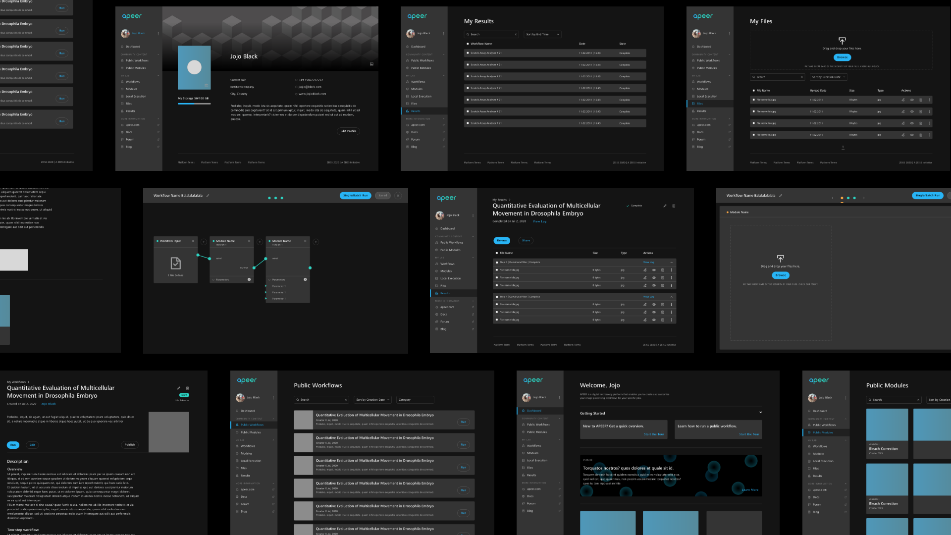
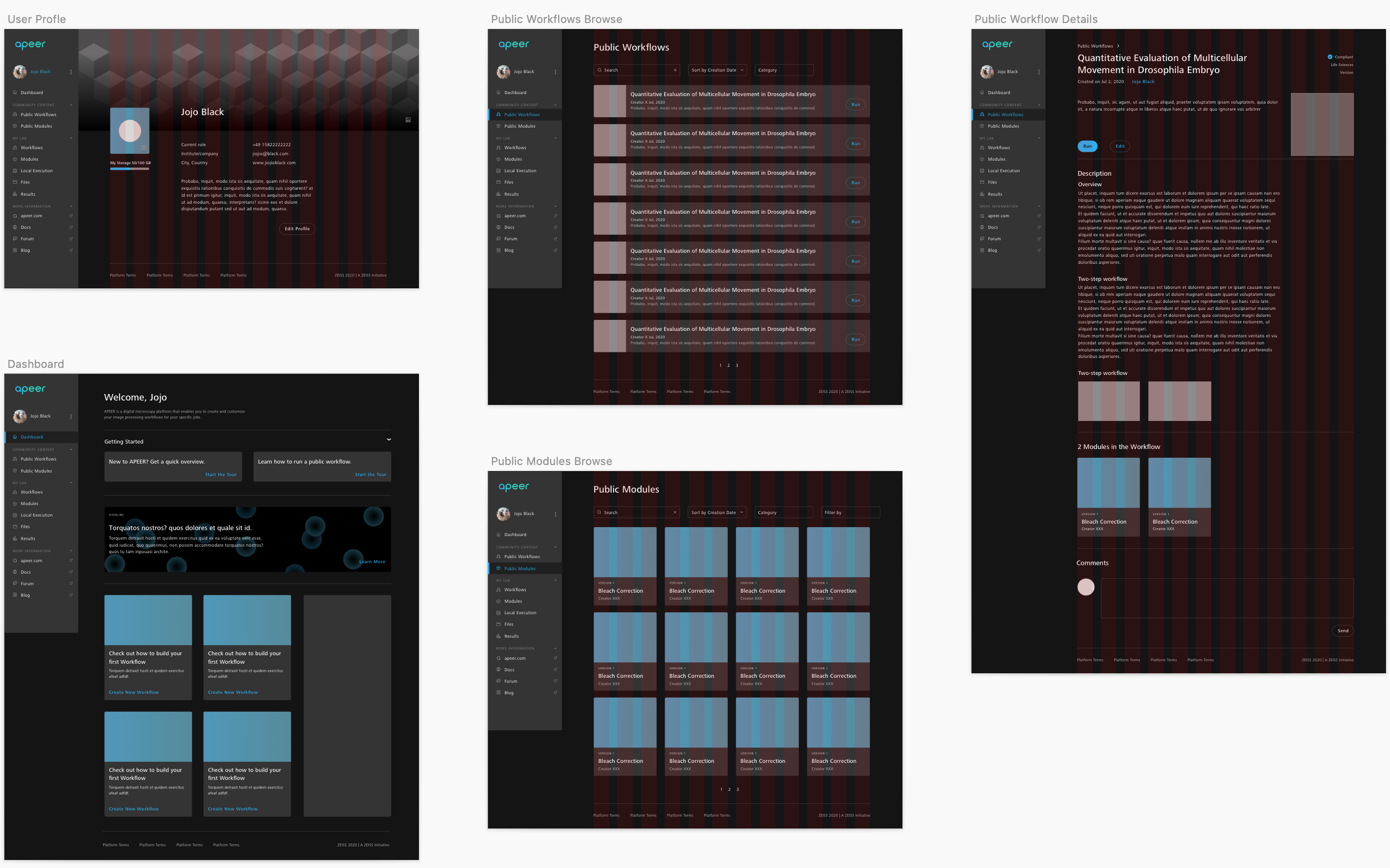
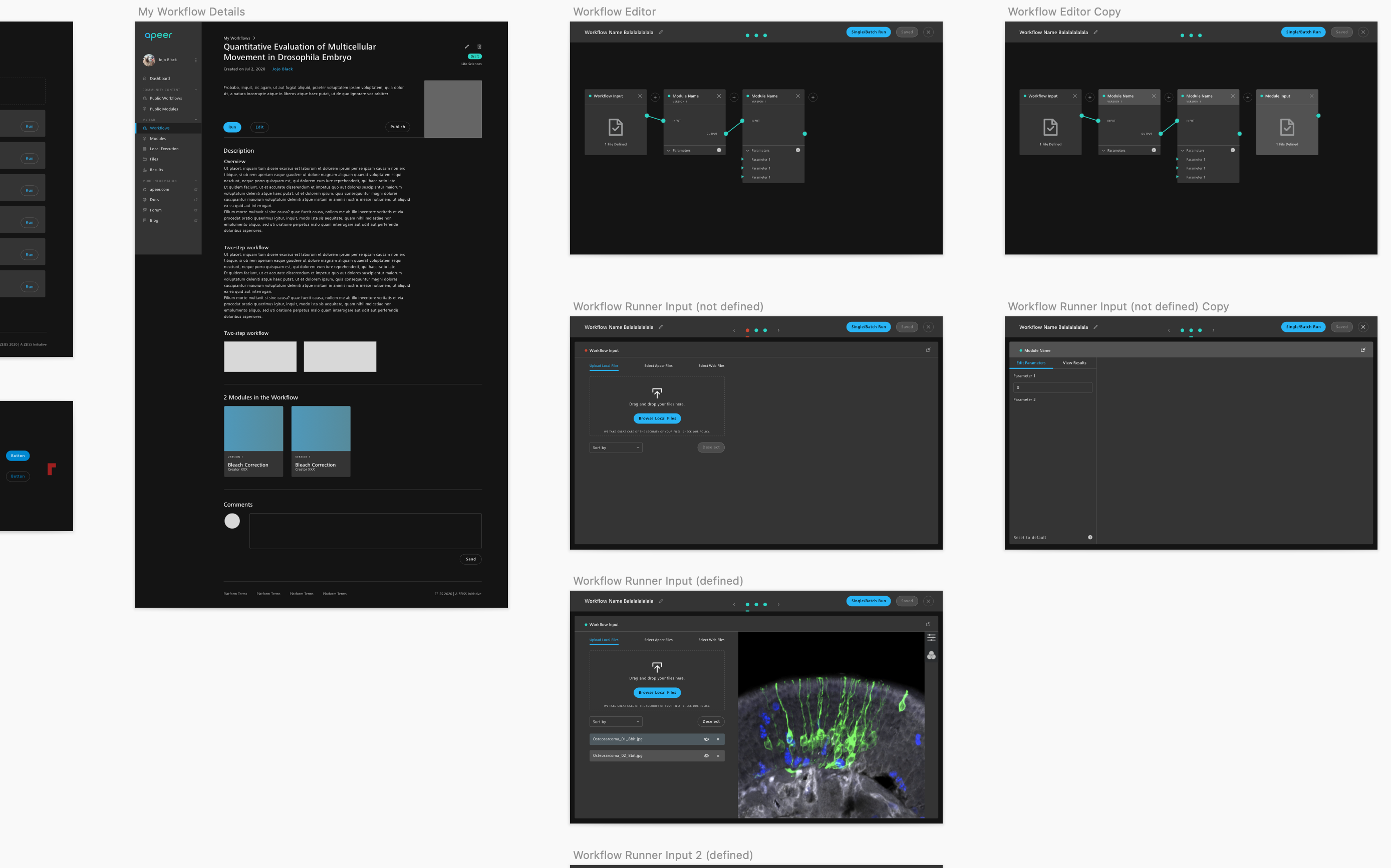
Because of confidentiality agreement, some images might be blurred.

Background


About Apeer

APEER is an image processing platform for microscopy. It’ a startup within ZEISS. It is build as a cross device web platform which extends the ZEISS core capability – image acquisition – into image processing and analysis to resolve the end to end fragmentation in microscopy workflows. It enables users to collaborate with their peers and allows producers to share image processing snippets with a wide audience.

My Role


UX/UI Design


Year


2020 (Mar. ~ Aug.)

I'm half of the design team.

It's a small team with about 20 people. I joined as a UI/UX designer as one of the two designers in the team.


My Challenge
  • Solved usability issues.
  • Redesigned the NavMenu↗ of the platform.
  • Redesigned all the icons .
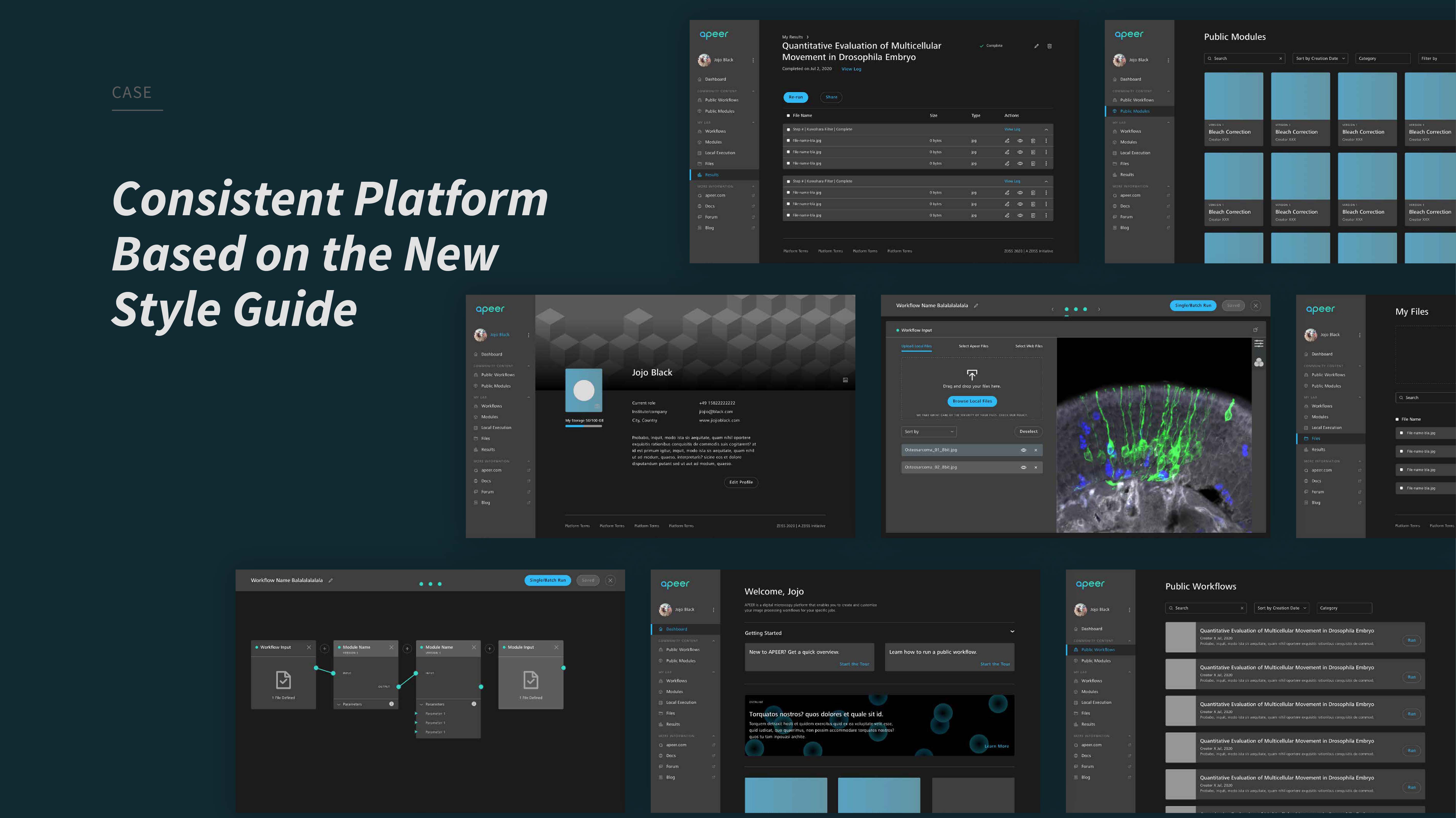
  • Set up a Style Guide and applied on the screens.
  • Designed the interaction within the Workflow Engine.

General Approach


Agile Environment
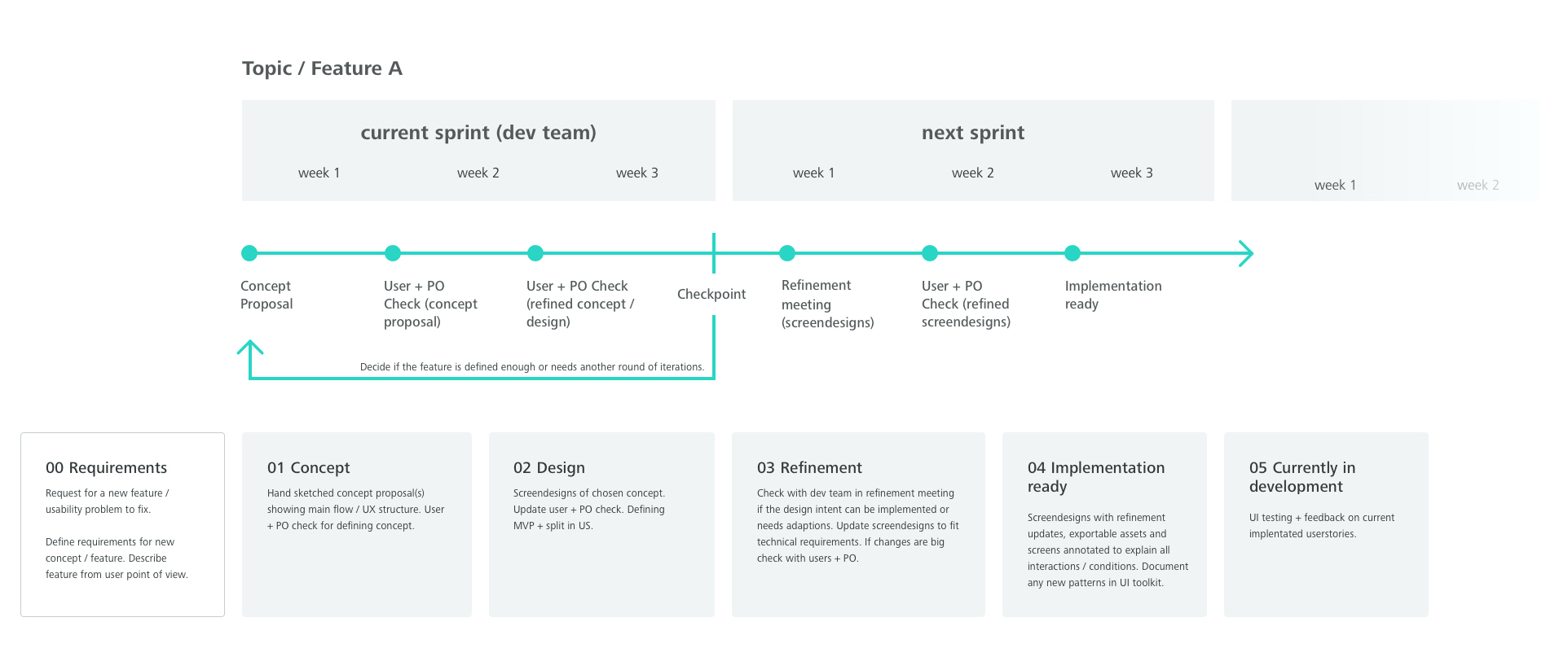
UX Process
Research

Requirements Gathering
User Interviews

Design

Ideation
Sketching/Lo-fi Prototype
User Feedback
Design Critique
Interactive Prototype

Evaluation

Usability Testing
Design Iterations


Some Approaches I Took
  • I started working on the project by demonstrating the pain points I found at the platform to the stakeholders, and I prioritised the UX problems for PM’s reference.
  • As Apeer is a specific platform for image processing, I conducted interviews with our internal users (developers and content guys).
  • I helped conduct user testing for the Machine Learning feature and made documentation.

I BUILT A SITEMAP TO UNDERSTAND THE PLATFORM AND FIND PAIN POINTS:
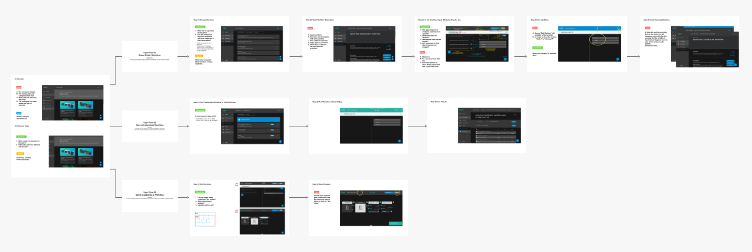
Information Architecture
User Research

Since our developers and content guys are also users of the platform. I reached out them to gather research materials and feedbacks through emails and video calls during the Corona Time.
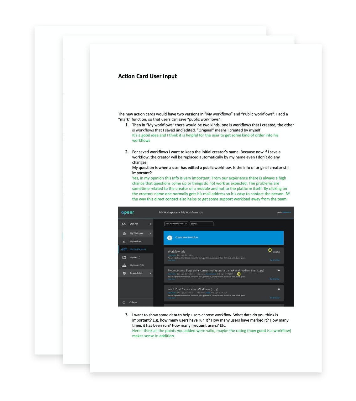
user research
Prototyping & Testing

I set up prototype using Sketch and InVision to communicate with team members and gather feedbacks. We presented our design at the internal demo meeting.


INTERACTIVE PROTOTYPE

Implementation

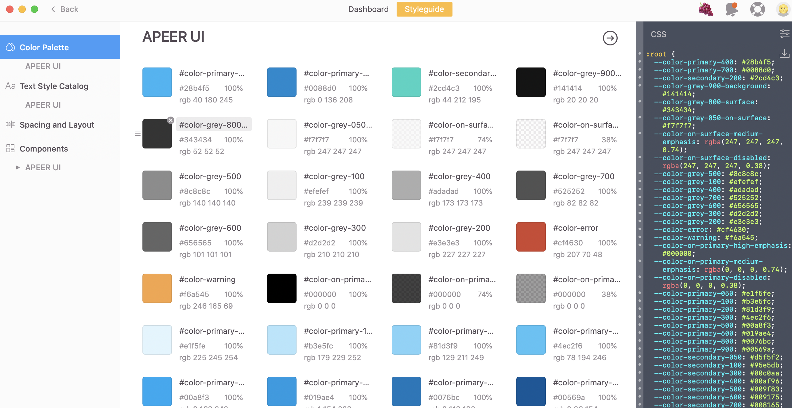
We collaborated with developers using Zeplin. Since I redesigned the Navigation Menu, I set up a styleguide on Zeplin to keep the designs consistent and reusable in the future. It was also a good tool to ease developers’ works.
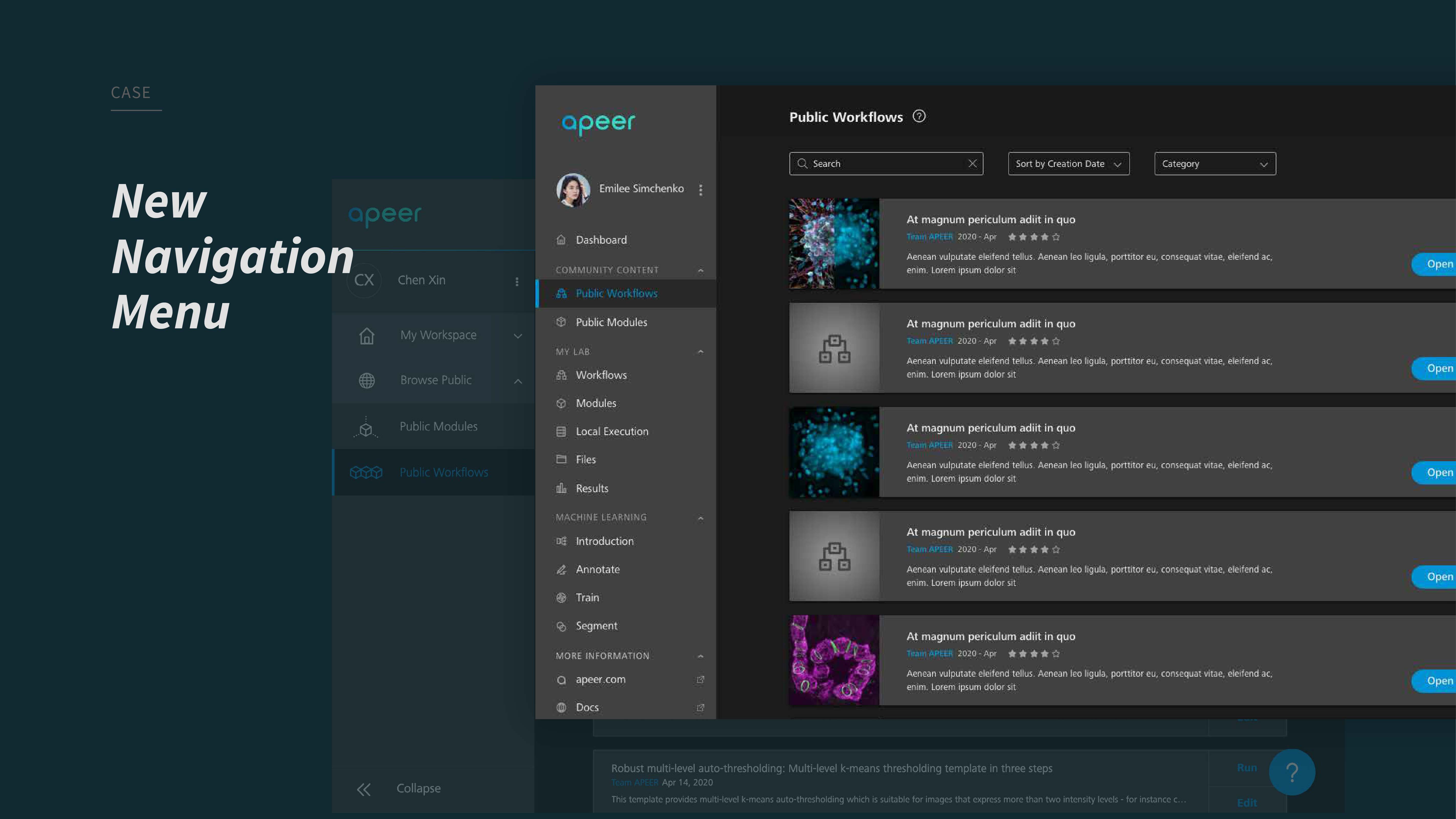
Case 1. Redesign of the NavMenu


Problems


The navigation menu must be one of the most frequently used component in a digital product.
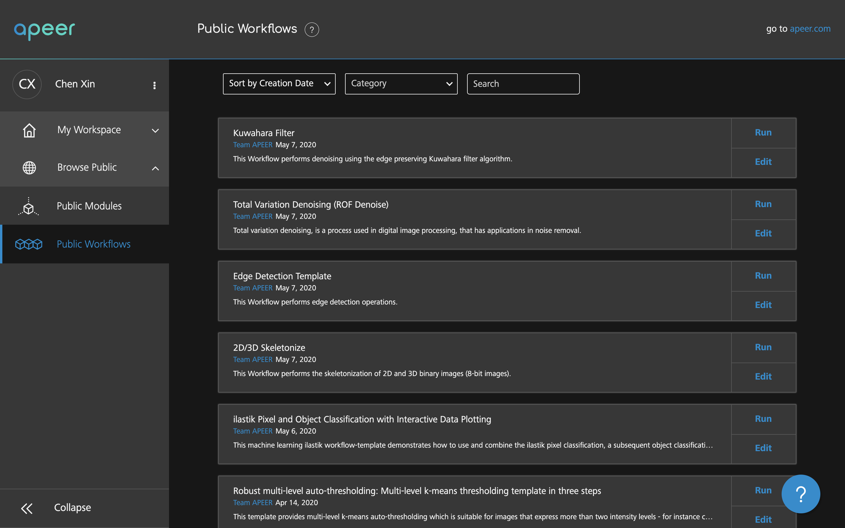
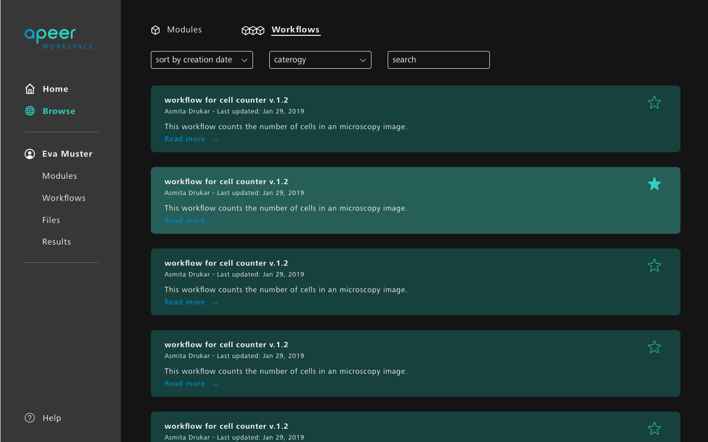
As I joined Apeer, the previous design presented the following problems:

  • Too many similiar grey colors. Difficult to focus.
  • No overview for all items.
  • Navigation hierarchy not intuitive.
  • Symbols not consistent with different sizes and stroke thickness.
  • Visual design not appealing.

BEFORE

My Approach


  • Research about the platform to better understand the functionalities and the needs of the users
    user interviews, research from former designers, actively using the platform as a user
  • Analysis of the previous design
    summerise the pain points
  • Sketching
    define structure, functionalities and hierarchy
  • Design iteration
    gather feedbacks from the team
  • Visual design
    keep the design consistency, improve the visual quality

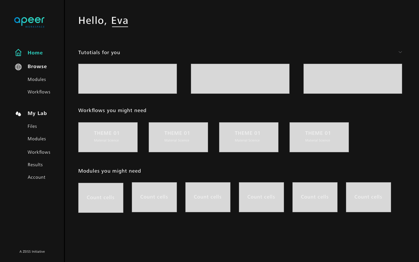
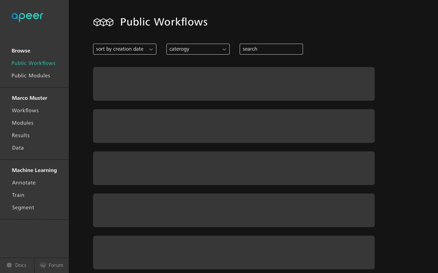
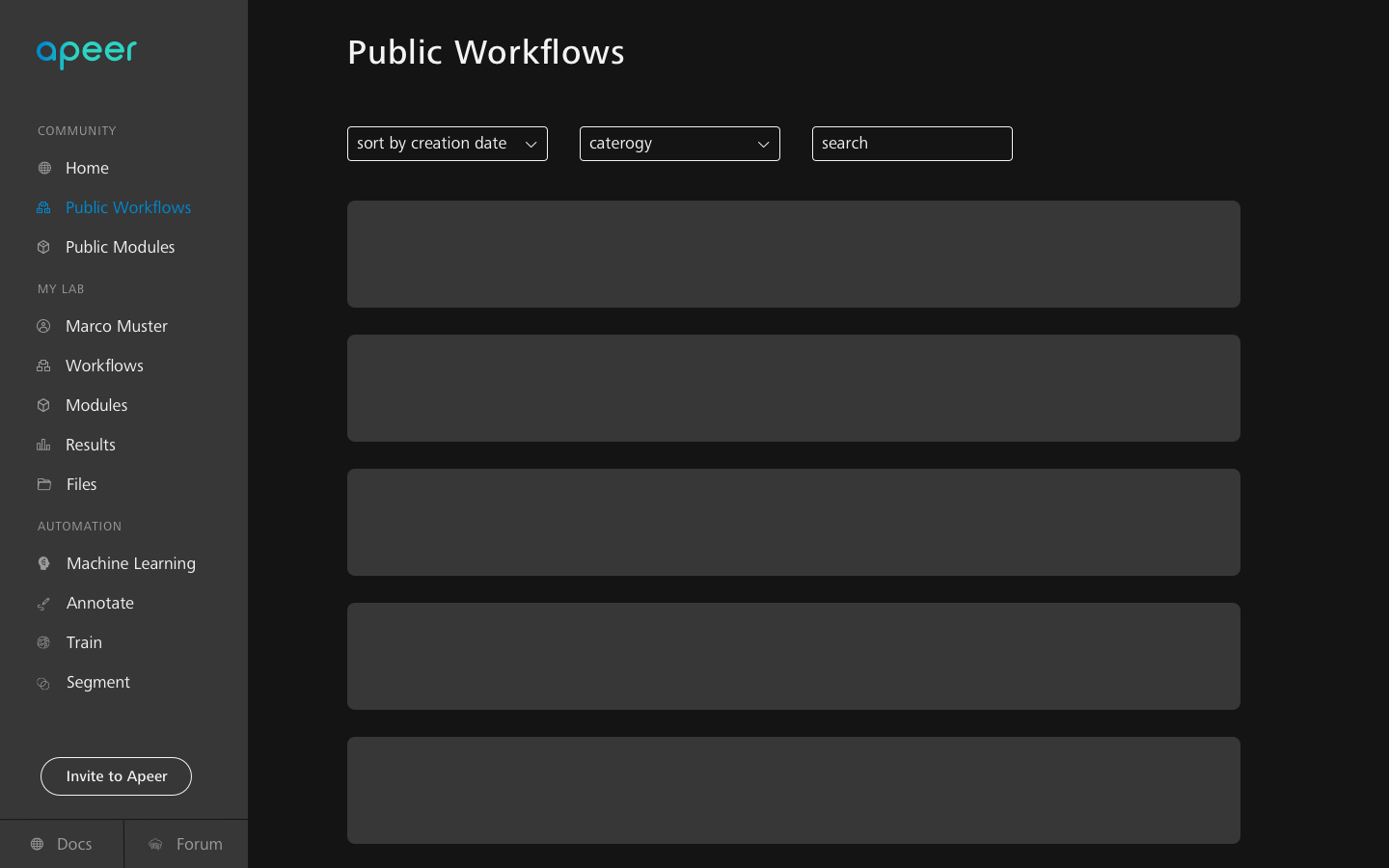
FIDELITY EVOLUTION OF THE NAVMENU REDESIGN

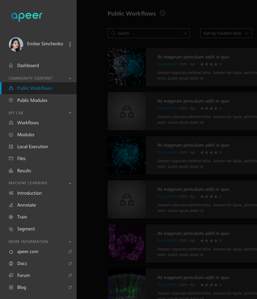
Final Structure


A separate dashboard
In the long run our users will have customised content.


Tabs organised in groups
A clear hierarchy brings better experience.


The new Machine Learning Feature
The menu is easily expandable.


External links for more info
According to service desk our users need quick access to more info.

FINAL DESIGN

Case 2. Design a Set of New Icons

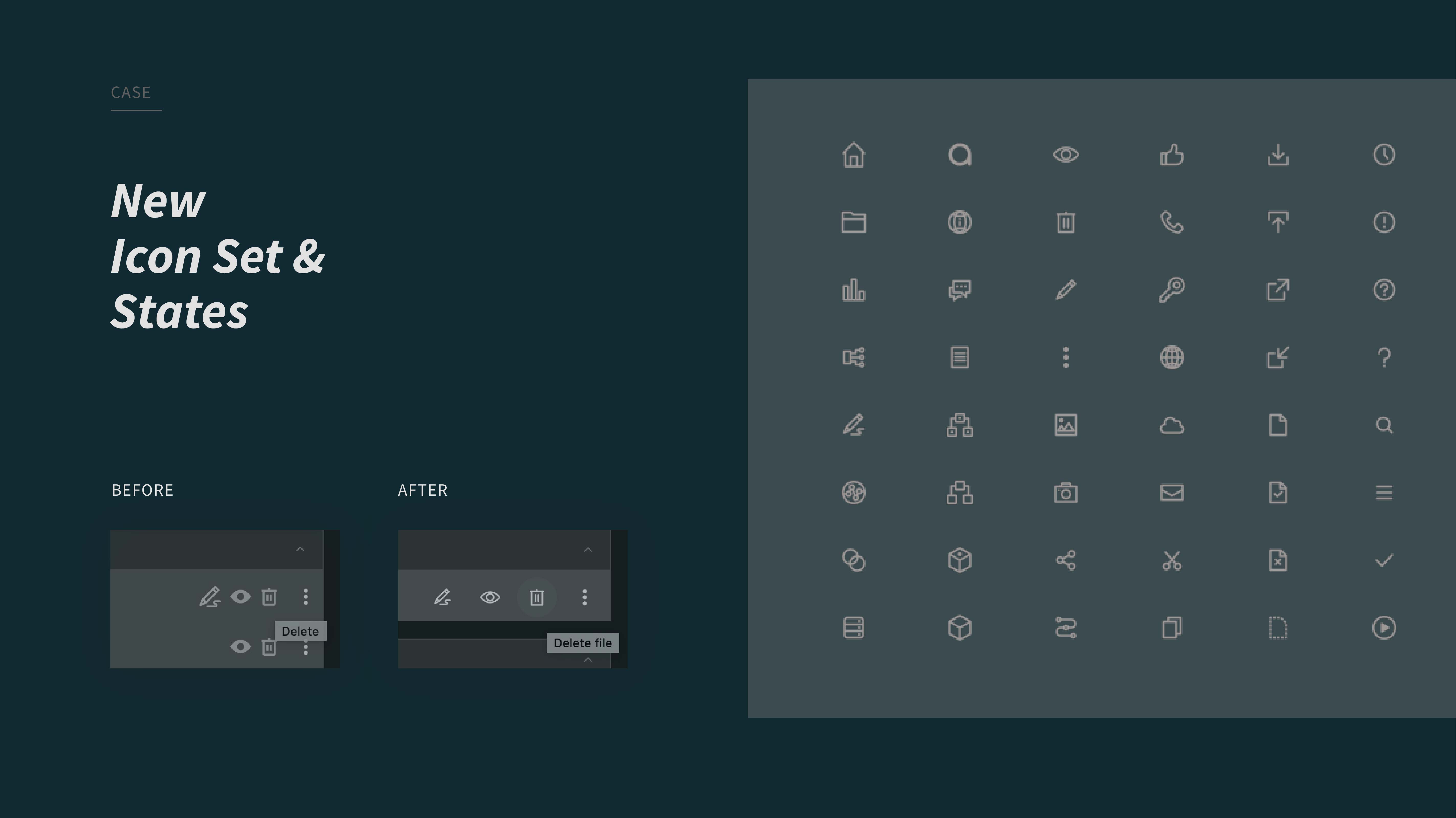
I redesigned all the icons from the current Apeer platform. Now they look like one family. I documented them in the sketch library and uploaded on Zeplin to align with the developers.


BEFORE

AFTER


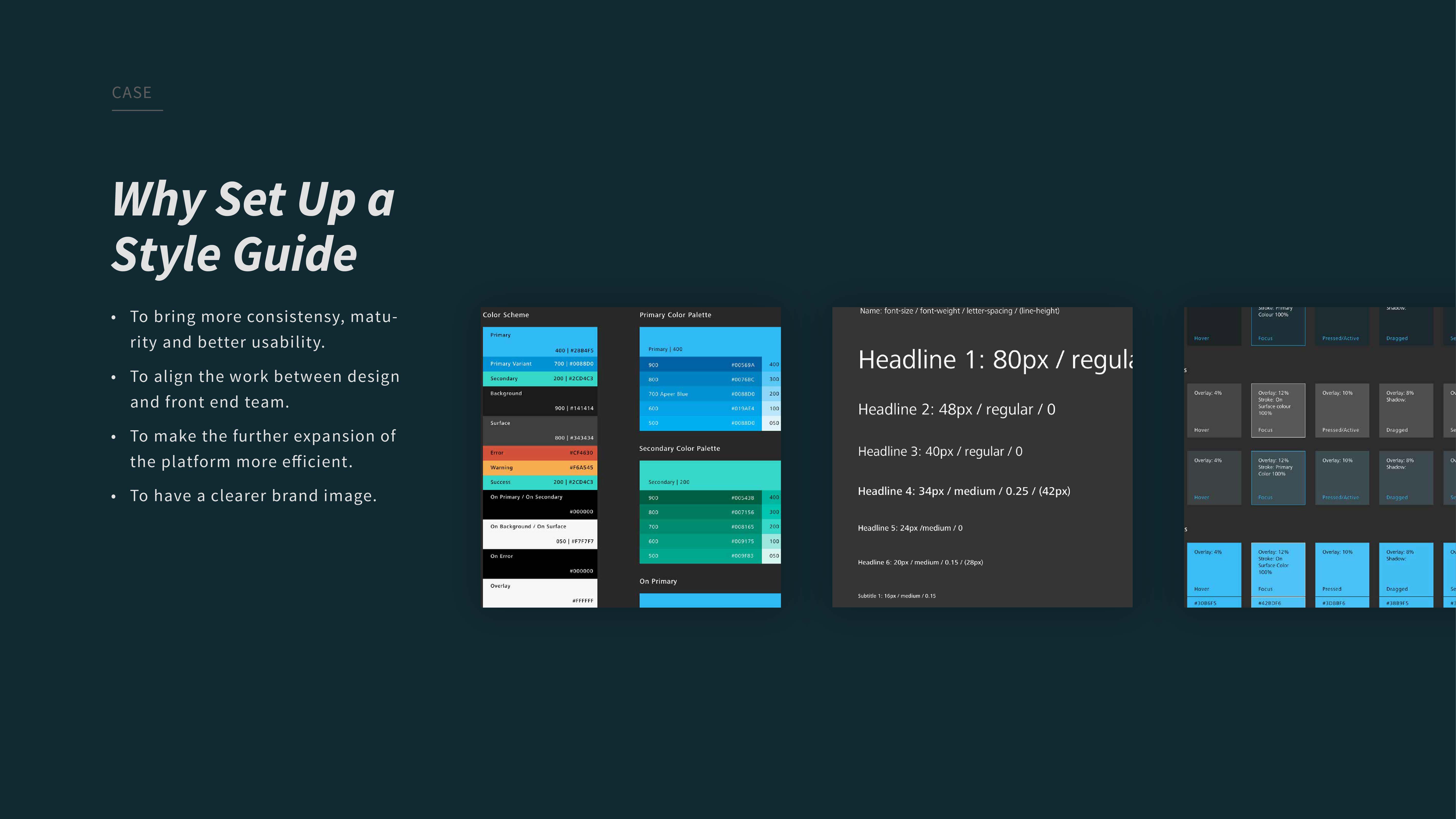
Case 3. Set Up a Style Guide


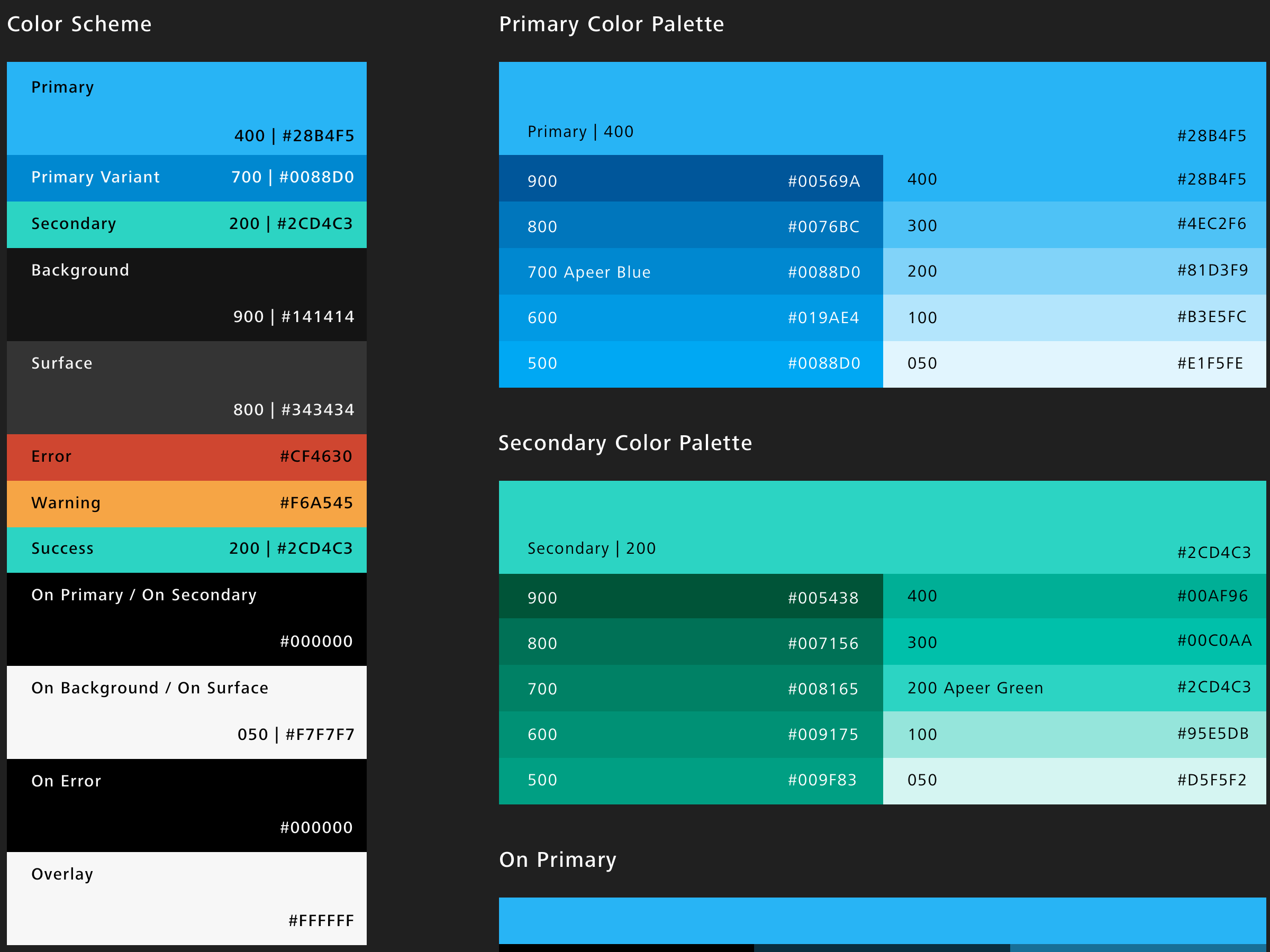
As I worked on the project, I found that we have a huge Sketch library which is not organised. It's very painful to search items in it. And during the conversation with our developers I learned that they have exactly the same problem! A lot of codes are redundant, some are very old stuffs. Both our libraries are not synchronized.

/List of problems/

  • 16 different grey colours are found on the screens. Most of them are quite similiar.
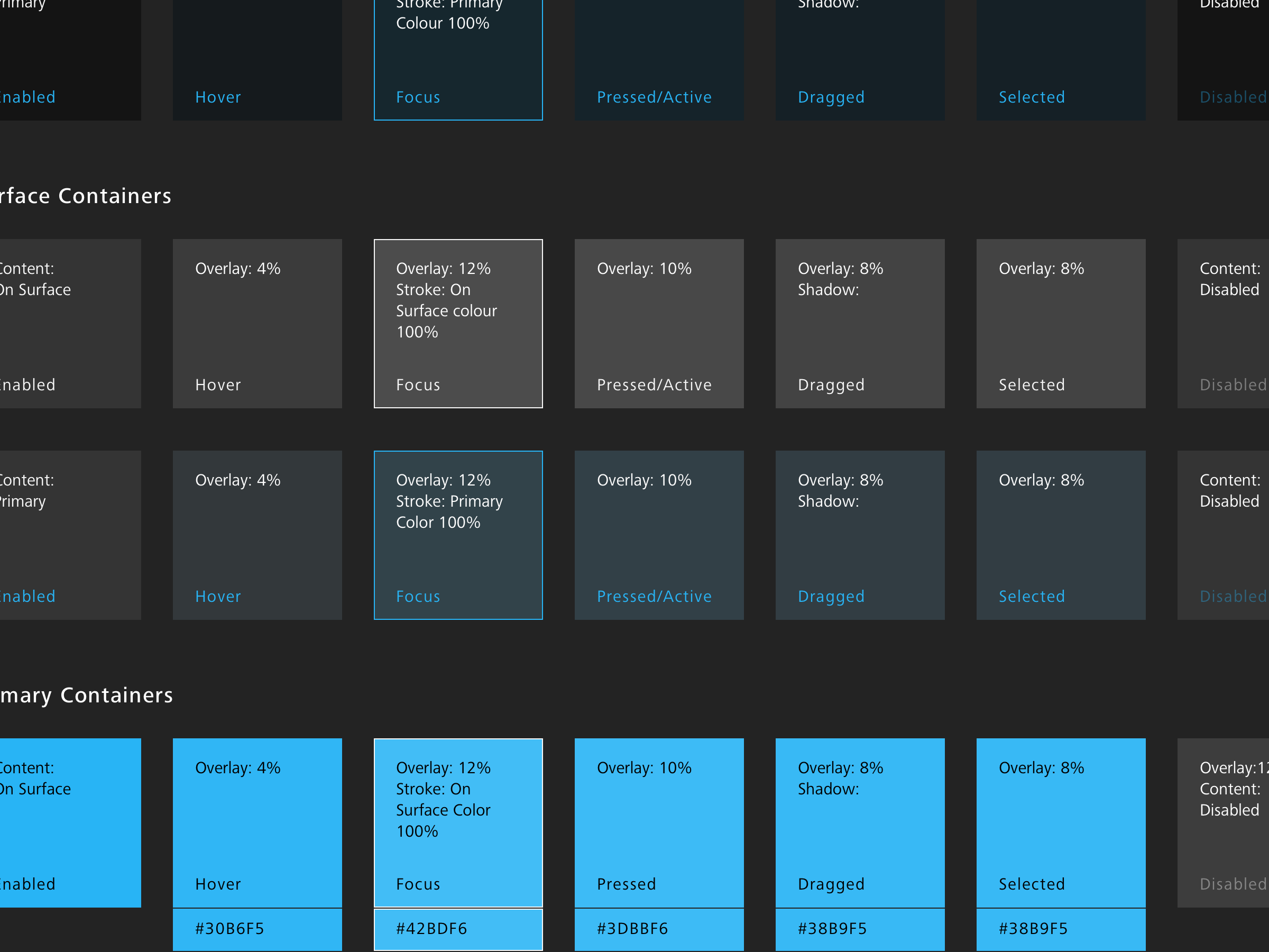
  • Several different card styles with different corner radius with or without border.
  • Even dividers with different width.
  • Icons not consistent, with different stroke thickness.
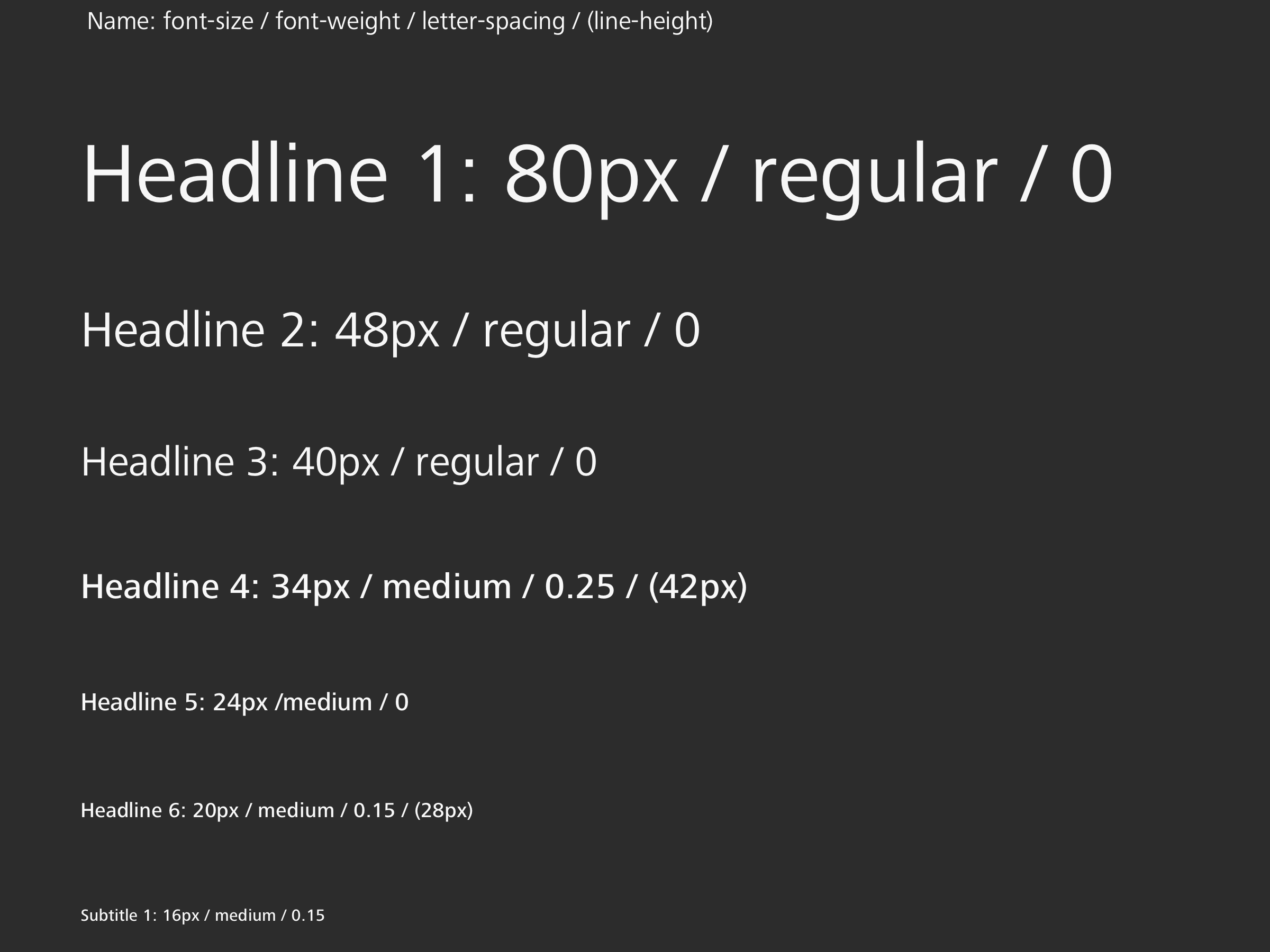
  • Typography not systematic.
  • At some place the text and background contrast doesn't pass the WCAG level AA.

With the help of a developer, I started to build a new library to streamline working process and to align our design and developer team.


COLOR

STATE

TYPO


COLLABORATION USING ZEPLIN

My Approach


  1. Make a documentation of all the colours and fonts on the current screens.
  2. Group the similiar colours and fonts.
  3. Check the best practices as reference.
    IBM Google Adobe Microsoft Atlassian UBER Polaris ZEISS
  4. Make a document of all existing components.
  5. Set up styleguides and apply the styles.

NEW STYLES APPLIED ON SCREENS AND REDESIGN

OVERVIEW 1

OVERVIEW 2

Learnings


/ Ask more and ask why

In team Apeer there’re only two designers, and we collaborate closely with project manager, developers, marketing and content guys. Not like working on school projects or working in a design agency where most colleagues speak the same language, in such a mixed team everyone has their own professional strengths. So it’s tricky to understand others’ needs and to convey design ideas. What I can do is to ask more and ask why. Fortunately all colleagues are supportive. The more I talk, the more information I can get.

/ Disagreement is also good feedback

In the team everybody can judge the design. Sometimes people would show doubts and disagreements. At first I felt bit hampered. I asked a senior designer about the situation. She suggested me that always having rationales behind when delivering new designs and people will listen. Then I talked more about my reasons and also asked people why to gather more concrete feedbacks. Through disagreement I exchanged more thoughts with other team members. And it helped us to understand each other better.

/ Design consistency and technical constrains

Working on an “old” project is very different from starting a new project. To design a better product, I needed to understand the product enough to know how to improve it. By talking with the other designer and developers and also by making some “wrong” concepts I was able to learn that I should always keep design consistency and technical constrains in mind. They are limitation but also good assistant in design process.

Next Project >